Business Partner Matchmaking App
Design Thinking • Design System
2024
Product Designer (UX/UI)

Introduction
In today's rapidly evolving digital landscape, many small businesses in Spain struggle to digitise their operations due to a lack of expertise and resources. To address this, the Spanish Government's Agents of Change Program aims to produce over 30,000 experts in digital transformation and offers eligible businesses grants of up to 20,000 euros for hiring these graduates. Despite these efforts, surveyed graduates report difficulties in securing their first gigs due to inadequacies in the existing system.
This project addresses these challenges by designing a matchmaking app that facilitates more effective and meaningful connections between small businesses and digital transformation experts.

Current system for companies to connect with graduates of the government program Agents of Change.
The Problem
Small business owners often lack the knowledge and resources to navigate digital transformation. The existing system, although straightforward, has significant limitations:
Inadequate profiles: Current profiles on the government platform are minimalistic, displaying only an ID, stage (enrolled, graduate, eligible, hired), location, and a LinkedIn link. This limited information makes it difficult for businesses to assess a candidate's suitability.
Restricted communication: Businesses can only contact experts through LinkedIn, with no in-platform messaging or notifications, hindering direct communication.
Lack of visibility: Graduates are not informed about which companies have viewed their profiles, making it challenging to follow up and personalise their outreach.
The Process
Throughout this process, I followed the Design Thinking phases of Empathise, Define, Ideate, Prototype and Test to ensure I had a user-centred approach to problem-solving.
Empathise
I recruited participants through LinkedIn and developed an interview guide (below) to explore user experiences, frustrations, and needs related to finding or offering digital transformation services. I conducted phone interviews whenever possible, but I also prepared an online survey for participants who preferred to do it on their own time.
During this phase, leveraging AI tools like ChatGPT proved invaluable. This tool assisted in optimising the interview questions and synthesising research data, significantly enhancing the depth and efficiency of the research.

Define
After analysing the research data, I defined the core problems and user needs through an Affinity Diagram (below) to identify common themes and insights; Empathy Maps (said, did, thought, felt) to visualise the emotional and functional needs of users; Key User Needs & POV that would articulate key user needs; and How Might We (HMW): Generated "How Might We" questions to guide ideation, such as "How might we facilitate better communication between businesses and experts?"

Ideate
I explored potential solutions through the Braindump brainstorming method and the SCAMPER Technique. Additionally, to get out of my head, I worked with ChatGPT to explore other solutions that could answer the two HMW (How may we) questions I had selected in the previous stage:
How might we filter through digital service providers/professionals to ensure they meet quality standards and client requirements?
How might we allow clients and digital service providers/professionals to find each other and communicate effectively?

Prototype
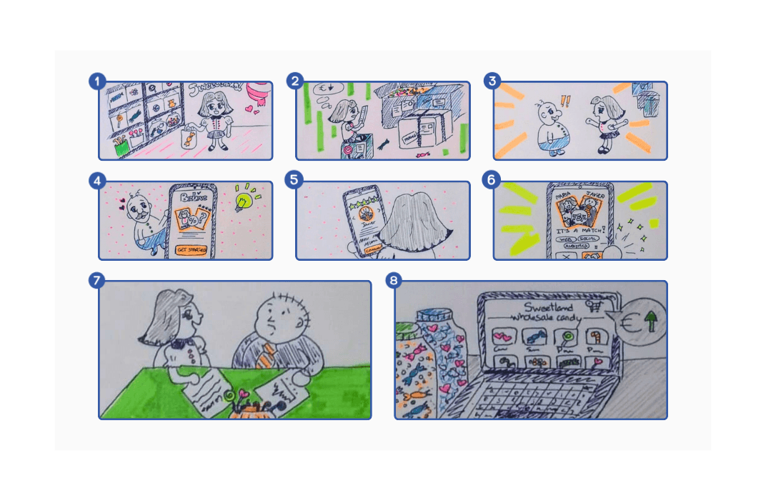
To help me communicate and test the design concept with users, I created a storyboard of the entire user journey behind my idea—from what makes a user decide to download the app to what happens when they use it.
This story features Marta, the owner of a sweets retail/wholesale business who is in dear need of digitising her business to reach more B2B customers. Following her husband's recommendation, she successfully downloads the app, completes onboarding and finds an expert who audits her business and offers her a digital transformation plan that sets her up for success.
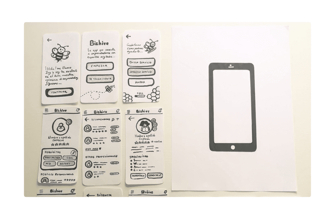
I would usually create wireframes digitally in Balsamiq, but I decided to experiment with paper prototyping because they are easy to create as well as modify and allowed me to test the concept of your idea, rather than its visual execution. As they are very obviously unfinished, users are more likely to share honest feedback. I was surprised at how enjoyable it was to prototype on paper, but my hand muscles got a serious nudge. Here are some screens taking the user through onboarding, finding professionals in the platform, seeing their profile and matching with another user. I added notes to explain how and why something on the screen should work as clear as possible.

Test
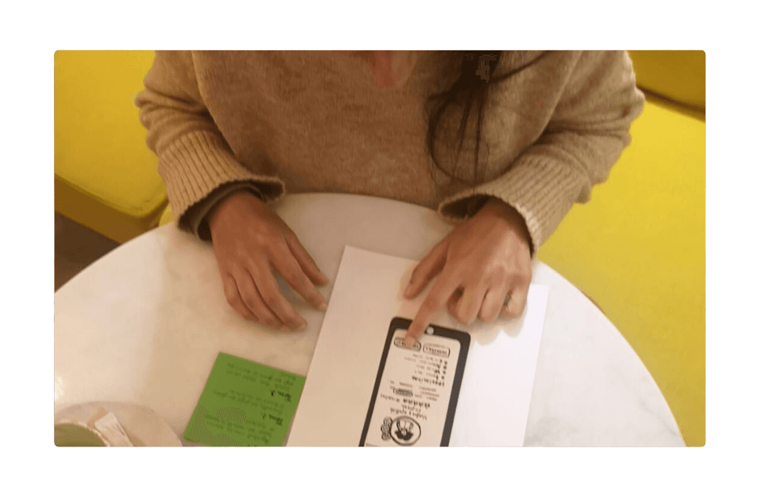
I met with test participants at a coffee shop for 30 min each to conduct in-person tests to gather immediate feedback from users, intending to refine the design based on their input. I refined the wireframes into more detailed paper prototypes that users could interact with.
The participant was given 3 tasks to complete and then I play-acted with them demonstrating what happened when they clicked on a certain button. Throughout the exercise, I specifically asked them to verbalise the steps they took to achieve each task. Meanwhile, I took notes on whether they could complete the tasks, usability, features and overall user satisfaction on a Feedback Capture Grid, with quadrants for likes, criticisms, questions and ideas. Additionally, I prepared a series of open-ended questions to gather feedback whenever needed.
During this phase, paper prototypes facilitated rapid testing and feedback due to their simplicity and low fidelity. While this method encouraged honest feedback from users, I transitioned to higher fidelity digital prototyping in Figma, which streamlined the iteration process and better showcased the app's functionality.
Aesthetic and theme
The app’s theme was inspired by the concept of a beehive, a metaphor for a busy and collaborative community. The interface features Ivy, a welcoming bee character who guides users through the onboarding process, enhancing user engagement and making the platform more approachable. Once onboarded, users enter the 'hive,' where they can interact with 'working bees'—the graduates—creating a sense of community and dynamism.
I used Microsoft Designer to help me come up with the app's mascot. It took multiple attempts refining the prompt until I got the right bee for Bizhive.
Animations were thoughtfully integrated into the design to create a smooth and engaging user experience. These subtle animations not only added to the aesthetic appeal of the app but also helped in guiding users through various features, making interactions more intuitive and enjoyable.

The solution
Feedback indicated a strong positive response to the app's ability to facilitate two-way communication, addressing a major gap in the existing system. I developed a digital prototype in Figma that incorporated essential features such as enhanced user profiles, in-app messaging, and profile visit notifications. This approach aimed to create a more interactive and responsive platform, facilitating a seamless and engaging user experience.
Full user profile: Bizhive profiles provide businesses with information to assess a candidate's suitability. Profiles include a profile picture, their full name, company name, ratings, bio and skills. Additionally, badges provide concrete evidence of a graduate's credentials and rankings.
Direct communication: The app not only allows small businesses to find and connect with graduates but also empowered the latter to reach out to businesses. This bi-directional communication capability aimed to foster more dynamic and effective engagements.
Visit data: Graduates are able to see who visited and interacted with their profiles so that they can follow up and personalise their outreach.
This solution aims to bridge the communication gap, offering a platform for business owners to find and engage with pre-qualified experts who can offer personalised advice and services and help them thrive in a digital-first world; and for graduates to find work and advance in their careers.
Learnings
Design thinking: This user-centered approach to problem-solving guided my design process and challenged me to think outside the box. This framework is a structured method to turn an idea into a tangible real-world solution.
User research: Conducted research to uncover user needs and pain points through telephone, online and in-person interviews. Immersing myself in the problem from the graduate and the business owner point of view helped me understand their needs, desires and struggles. Feedback indicated a strong positive response to the app's ability to facilitate two-way communication, addressing a major gap in the existing system.
AI as a design buddy: ChatGPT was a fantastic partner throughout the design process. Some of the ways I was able to leverage this technology was to optimise interview questions, synthesise research results and brainstorm possible solutions. I also used Microsoft Designer to help me come up with the app's mascot, which brought life to the product.
Paper prototyping: They were surprisingly enjoyable to create, and users seemed to also enjoy using an analog version of an app. As it didn't look like a finished digital product, they were keen to share honest feedback. While it was useful for early testing, it was more time-consuming to create and modify than digital wireframes so I may opt for a digital method when faced with tight deadlines.
Variables: Design variables make for a more adaptable design system overall. Exploring Modes inspired me to look beyond the government site and into other use cases, as they allow me to easily rebrand the app at any point in the future.
Design system: I started with the fundamental elements that would be used across the product, such as color palettes, typography, and primary UI elements (e.g., buttons, forms, and grids). This foundation helped ensure consistency and provided a cohesive user experience. While I was tempted to emulate some of the complex Design Systems I had previously used, I decided to let it evolve organically and iteratively in response to the project’s needs. As a result, I created a design system that supported the current product whilst allowing the addition of future elements.
Animations: Integrated animations to make the design more attractive, improve user engagement and overall experience.
Conclusion
This project highlighted the critical need to address both user and expert requirements in the design process. The matchmaking app effectively bridges the gap between small businesses and digital transformation experts, offering a platform that fosters better communication and engagement. The thematic use of the beehive and the character Ivy not only enriched the user experience but also ensured a memorable and cohesive design.
The learnings in this project will be invaluable in future projects, especially those involving complex user interactions and scalable systems. The project serves as a model for how thoughtful design can bridge gaps in communication and functionality, ultimately leading to more effective and meaningful connections in the digital transformation space.